Restructuring Cognizant’s mega menu
Increasing traffic to secondary pages by 40%
Winter 2024
Role: User Experience Lead at Cognizant
Tasks Performed: User research, prototyping, UX design
Programs Used: Figma, Adobe Target, ContentSquare
Team: Cognizant Corporate Marketing (Brand, Web, Marketing, IT, Analytics)
20% increase in destination page visits
Improved content discoverability across service lines
Established scalable navigation UI patterns
Introduction
Cognizant is a multinational information technology services and consultation company. They serve over 15+ industries and help companies modernize technology, reimagine processes, and transform experiences to stay ahead in a fast-changing world.
Cognizant has 5,000 daily users and hundreds of pages, but its tertiary pages experience low visit times and traffic. The primary navigation had evolved over time — shaped by internal org structure rather than user needs.
As the company expanded its service offerings, the mega navigation became:
-
Overloaded
-
Redundant
-
Difficult to scan
-
Misaligned with user mental models
Marketing stakeholders wanted improved discoverability. Leadership wanted measurable growth in destination traffic.
The challenge: Redesign the global mega navigation without disrupting enterprise governance or SEO performance.
Problem
2 months after the launch of the initial mega menu, we received an analytics report comparing the new menu’s performance to the former. It identified some success:
- Overall visits to the subpages in services/industries have grown after the launch of the new layout
But have some overwhelming adverse results:
-
-
- Overall visits to the main landing pages in services/industries have declined by 20%
- Important links were visually buried
-
High drop-off after homepage interactions
-
Columns lacked clear hierarchy
-
Navigation is structured around internal language rather than user intent
-
Low engagement with the mega menu is a concern, as it suggests users are not leaving the home page. We needed to address the mega menu’s lack of clear navigation choices. The decrease in visits to secondary pages such as ‘Banking’ or ‘Data and AI’ is a missed opportunity for internal marketers, and we understand the need to address this.
The navigation reflected how the company was organized, not how customers search for solutions.
Research and discovery
Behavioral data review
Using Contentsquare and site analytics, I analyzed:
-
Click distribution across navigation items
-
Heatmaps on mega menu interaction
-
Scroll and engagement patterns post-click
-
Destination page traffic trends
We identified:
-
A small percentage of nav items received the majority of clicks
-
High-value service pages were underperforming
-
Users hesitated within multi-column dropdowns
Competitive and heuristic audit
I conducted a navigation benchmark across enterprise technology competitors to evaluate:
-
Information hierarchy patterns
-
Labeling conventions
-
Interaction density
-
Progressive disclosure strategies
This revealed an opportunity to:
-
Reduce cognitive overload
-
Group offerings by buyer intent
-
Improve scannability
- Update UI to compete with industry standards
Strategy
Visual hierarchy & scanability
The previous mega menu treated most links with equal weight. I redesigned the layout to:
-
Introduce stronger typographic hierarchy
-
Create clear group headings
-
Add spacing to reduce visual crowding
-
Improve column balance
-
Establish consistent link styling patterns
This reduced cognitive load and improved decision-making speed.
Interaction design refinement
Enterprise mega menus must feel stable and predictable. I improved:
-
Hover delay timing to reduce accidental triggers
-
Pointer tolerance zones
-
Visual hover states
-
Focus states for keyboard navigation
-
Clear indication of expandable sections
The goal was to make interaction feel intentional, not fragile.
Highlighting priority content
Not all links carry equal value. Working alongside analytics and marketing, I designed:
-
Featured content modules within the mega menu
-
Visual callouts for priority service areas
-
Differentiated styling for high-traffic destinations
This allowed strategic emphasis without overwhelming the layout.
Design process
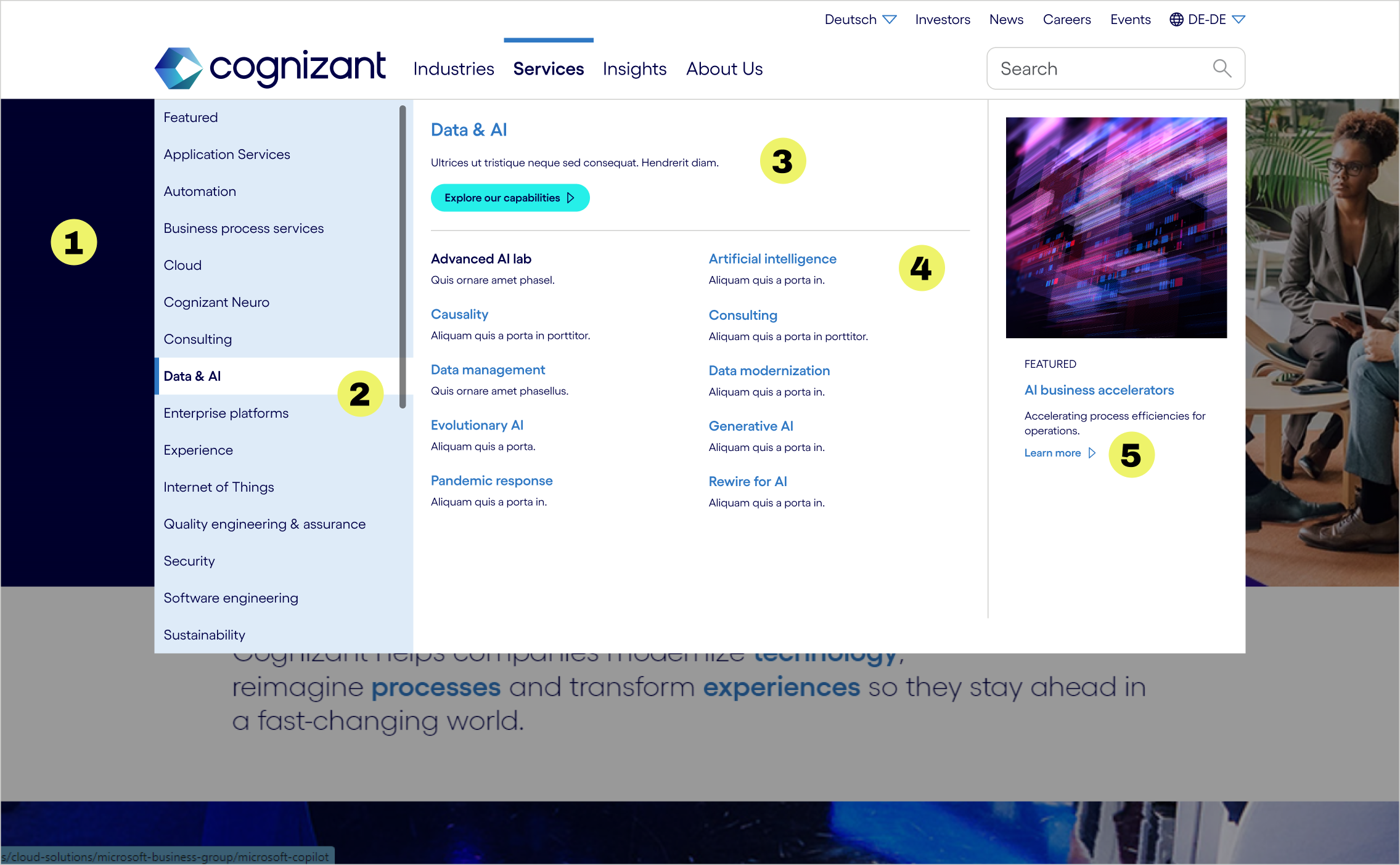
While the first mega menu approach succeeded in giving more visibility to tertiary links, the decrease in users reaching secondary could not be overlooked. The navigation needs a clearer hierarchy and more meaningful utilization of space.
- Reduced size of menu so it is no longer full screen and lessen user frustration
- United the navigation by lowering the contrast of the UI elements
- Prioritized the secondary link by adding a description and CTA
- Organized tertiary links into two columns to better utilize space
- Enhance personalization by adding a “Featured” section in each flyout

Results
We undertook a comprehensive process to enhance the user experience of the mega menu on cognizant.com. This initiative involved rigorous analytics, iterative design revisions, and thorough usability testing. Through these methods, we were able to identify key areas for improvement and implement changes that significantly transformed the menu.
The updates we made resulted in a more organized and visually engaging menu that effectively addresses the needs of our users. By prioritizing user feedback and behavior insights, we ensured that the new design not only improves navigation but also fosters a more enjoyable interaction with the website. Our commitment to creating a seamless user experience has been paramount in this project, and we are pleased with the positive outcome.
%
visits to primary pages increased
%
visits to destination pages increased
%
