Designing for engagement
Optimizing Cognizant’s Interactive Research Report Experience
Role: User Experience Lead at Cognizant
Tasks Performed: User research, prototyping, UX design
Programs Used: Figma, Adobe Target, ContentSquare, WEVO
Team: Cognizant Corporate Marketing (Web, Research and Thought Leadership, Global Creative, Analytics)
20% increase in scroll depth on research report page
Improved content engagement and section visibility
Established scalable template for future reports
Introduction
Cognizant publishes in-depth research reports diving into the impact of AI on the workplace and how businesses can prepare for the upcoming era. These reports have been playing a key role in establishing Cognizant as a trusted AI builder for enterprise businesses.
These reports are high-value marketing assets designed to:
-
Position the brand as an AI thought leader
-
Capture enterprise leads
-
Educate C-suite decision-makers
However, analytics revealed a problem:
Users were not scrolling below the fold to uncover key insights.

Problem
60% of visitors exited before the page break
Users are presented with little content when first landing on the page. The real estate is taken up by a promotional hero banner, rather than insights that would encourage users to continue reading.
Sharp drop-offs after the first sections
15% of users drop upon reaching the first section and an additional 15% drop by the third section. The sections consists of large, full-width banners and dense paragraphs that are difficult to skim.
Poor visibility of key CTAs
While there is a “Download PDF” CTA above the break of the page, the same CTA at the bottom of the page recieves more interaction. Users are also interested in the other blogs promoted at the bottom of the page.
The reports were content-rich — but the experience felt static and dense.
The challenge: Increase engagement without oversimplifying complex enterprise insights.
Research and discovery
Behavioral analysis
Using Contentsquare and analytics tools, I reviewed:
-
Scroll heatmaps
-
Engagement zones
-
Click behavior within long-form pages
-
Time-on-section metrics
Behavior identified:
-
Heavy attention on the hero and intro
-
Significant drop-off in mid-page dense text sections
-
Underperforming CTAs buried below heavy content blocks
I reviewed existing research report pages and concluded:
-
Overuse of long paragraph blocks
-
Inconsistent section rhythm
-
Lack of visual breaks
-
Minimal interactive engagement opportunities
Reports were formatted like PDFs on web pages — not web-native experiences.
Validation through A/B with WEVO Pulse
What is WEVO Pro?
WEVO Pro provides maximum confidence insights through 120+ live participants and expert analyst validation.
Testing approach
The study focused on four goals:
- Validate alignment between AI value and user needs
- Assess how easily users could locate key information
- Identify the most effective way of showcase Cognizant research
- Evaluate clarity and resonance of messaging across audiences
The study focused on three core audience:
- C-suite technology leaders (ex. CIO, CTO, CDO)
- Line-of-business executives (director and level)
- Mid-level managers with decisions-making authority
Task to complete:
Navigate through different sections of the Cognizant website. Review the AI-related content, research and insights provided. Determine in the information aligns with what you were looking for. Identify key takeaways and valuable insights. Assess how easy it is to find relevant information. Consider whether the website structure and navigation support your learning experience.
Experiences tested
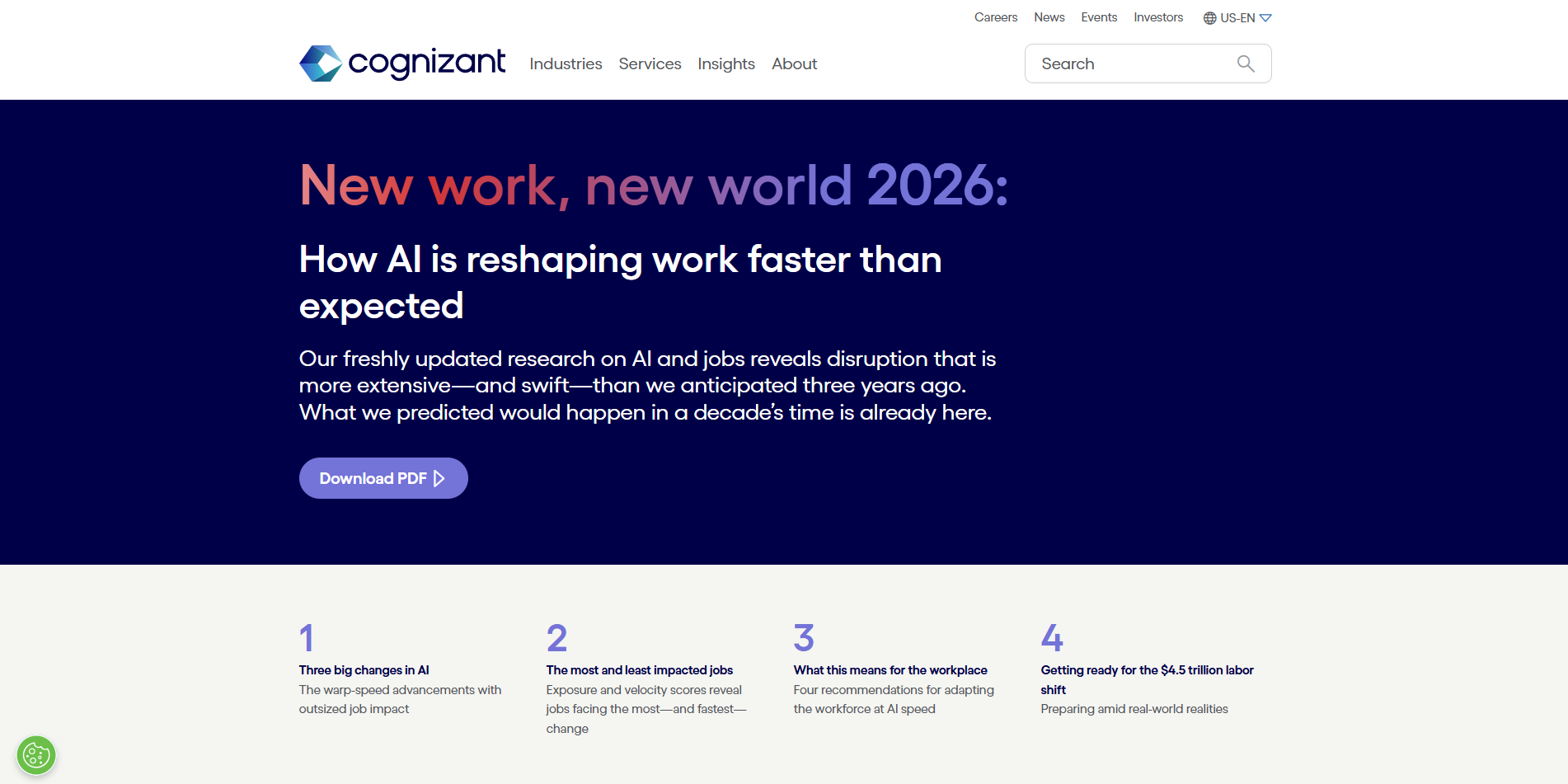
Variant A
Original long-form report layout.
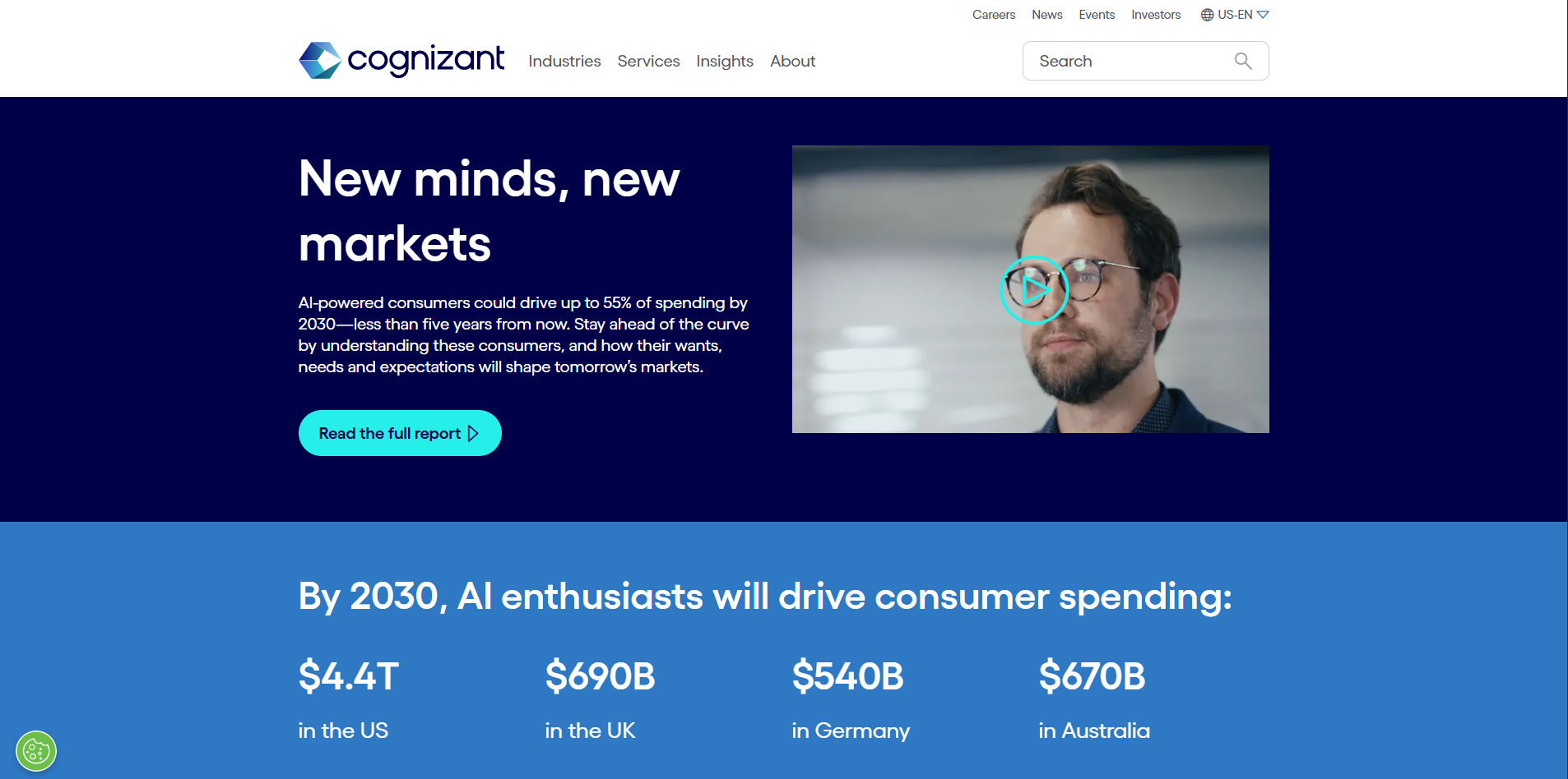
Variant B
Redesigned experience with:
-
Improved pacing
-
Interactive modules
-
Repositioned CTAs
-
Enhanced hierarchy
Variant A
Variant B
Outcomes
Key findings
User found the content on Page A overwhelming
- Users strongly appreciated the depth and credibility of Cognizant’s research, viewing the company as a leading authority in AI
- The dense and overwhelming content made navigation and quick comprehension challenging
Users believe Cognizant is a thought leader in AI and technology
- Both jouneys reflected a mostly positive view of Cognizant as a thought leadership
- Few users felt content presented was overly broad
Users find visual and interactive element to be helpful
- Users found tables, charts, and graphs added clarity
- Collapsible accordions and succint summaries helped users process information without feeling overload
Results
20% increase in scroll depth on research report page
Increased interaction with expandable modules
Greater visibility of mid-page CTAs
Scalable template for future research reports