Treats ‘n Beans case study
Summer 2021
Role: Digital Design Intern at Responsival
Tasks Performed:
-UX Design
-Rebranding
-User Research
-Social Media Marketing
Programs Used:
-Figma
-Illustrator
-Canva
Who’s Using?
When designing a website, it is vital to identify who is using it. For a local business, it is best to appeal to the community. Oakland is populated with two things, colleges + hospitals. The slides identify three types of people who may find themselves using Treats ‘n Beans website.
How are they using?
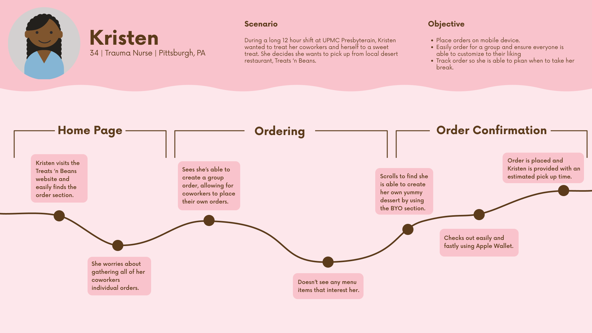
After identifying our users, a designer wants to imagine how they would use the website. The benefit of predicting possible conflict or euphoria allows for a designer to resolve any points of user friction in the final design. For this project, I decided to track Kristen’s journey since her situation calls for the most online interaction.

Reimaging the Brand
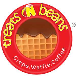
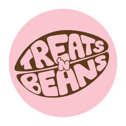
The neighborhood of Oakland is crawling with youth. Thousands of young adults are poured into the area a year, and all of them are looking for a cool, trendy place to grab a bite. Treats ‘n Beans old logo (left) is stiff and stale, which is not something you want to biting into a delectable treat.
Some of Oakland’s most successful restaurants, such as CHiKN, Hello Bistro + Chickn’ Bubbly, all have playful + graphic branding, which is vital in the age of social media.


A Website that Encourages Return
A website that keeps users coming back is a website that works. How do we create loyal users? By eliminating user friction, installing a breezy ordering system, and creating a loyalty system. These features create a website that a user can depend on.
Treats ‘n Beans actual website does not include an ordering or loyalty system. Including these elements will encourage users to visit their website rather than Grubhub’s, which currently appears first on Google.


